Is Your Landing Page Having an Existential Crisis?
Have you ever pondered about the meaning of life? Why you exist on this Earth? What is the sheer purpose of your being? If you’re a human then you’ve probably asked yourself these questions, hopefully to a lesser degree.
But if you’re a business going through the struggle of a landing page not driving in conversions, then you’re probably asking those same questions about your landing page. It’s one of the Internet’s greatest mysteries:Why isn’t my landing page converting?
Well, that’s what this blog post is for. No, not to answer the heavily-debated, highly-controversial “meaning to life.” It’s here to help you and your business do a complete 180 on your struggling landing page.
When looking at a landing page and its definition as it applies to digital marketing, it’s referred to as a “standalone web page distinct from your main website that has been designed for a single focused objective.”
A well-executed, well-designed landing page can prove to be an excellent tool for your business. Landing pages can provide companies with more customers, leads, and potential for profitability. If it’s not doing any of those things, then we’ve got problems buddy.
As with most things relating to CRO, there are a number of factors that could contribute to the lack of conversions. Maybe it’s not driving enough traffic from your primary site? Maybe your campaign isn’t doing as well as you’d hoped? Maybe it ranks too low in the SERPs?
These are all factors relating to actually landing on your landing page. But for the sake of this post we’re going to focus on bounce rate, the percentage of users who leave your landing page without actually completing a conversion.
Below are eight tips that will help you on your mission to decrease that bounce rate and increase conversions.
Test, Test, And Test Some More
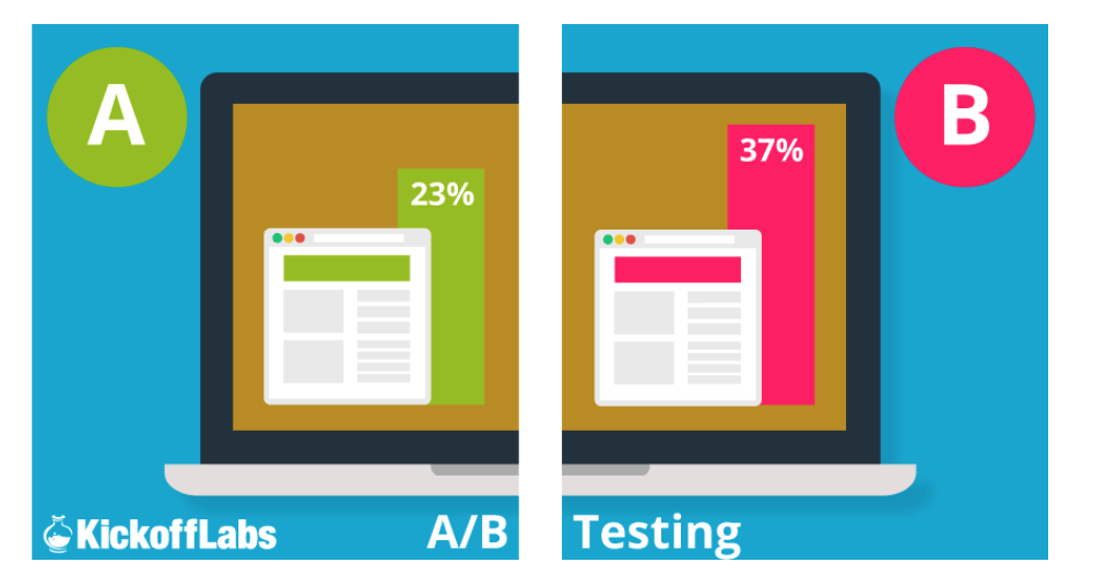
Before you make any changes to your landing page, put together some A/B tests together first. Diagnosing what’s wrong with your landing page will save you the time and effort of changing something that didn’t need changing, or even rebuilding a whole new landing page from the ground up.
Related: Basic CRO – Optimize Your Landing Pages With These Tips!
Knowing what to A/B test is the tricky part. Try to focus on areas that are intended to grab the user’s attention. A few examples of tests you could try include:
- Testing the phrasing of your headlines and CTAs
- Testing two different hero images
- Short vs long supporting text
- Different colors and where they’re applied
Form Goes Above The Fold, Capiche?
In order to maximize opportunity and capitalize on a user visiting your landing page, the elements of your page “above the fold” (the very top section of your landing page as its viewed in a browser window) should grab the user’s attention.
Users typically spend 0-8 seconds on your landing page, so ensuring that messaging, imagery, and most importantly, the form, is placed above the fold is critical. The term comes out of the newspaper industry where it refers to a paper’s front page headlines.
Related: How to Design the Most Effective Forms for Your Website
In both instances, you’d want the user (or reader) to see the most prominent information upon first view of the page (or paper). Because the window of opportunity is so slim, you’d want to design the top of your landing page to be as conversion-oriented as possible.
Never Include Links To Other Pages Or Websites. Just Don’t.
The primary goal of your landing page is to receive a conversion action from your user. Don’t screw that up by including a link that goes back to your primary website, or links out to your social media accounts.
Unless your landing page’s conversion goal is for click-throughs via an e-commerce funnel, there’s no reason to include links that go outside the landing page. One of the best ways to get a user to convert on your page is to keep them there. Pretty obvious, right?
Anchor ID Buttons Can Be Your Friend
If you get a user that actually chooses to scroll through and digest the content on your landing page, the hard part is done. But what happens when they get to the bottom. If they want to sign up or buy into what you’re selling/pitching, chances are the sign up form is at the top of the page (at least it better be, ahem).
Related: 9 CRO Facts That Will Convince You to Use It [VIDEO]
Most users, myself included, are lazy. Flicking your finger to scroll up a page is way too much work for the average user (oh, the irony!). Anchor ID buttons are the best way to resolve this first world problem. It’s easy to implement and allows a link to scroll to a particular section of a page.
It’s a great strategy, particularly for longer landing pages, that allows engaged users to navigate throughout the page. Depending on the length of your landing page, it’s best practice to utilize 2-3 anchor buttons on your landing page – one in the middle, one at the very bottom, or both.
Optimizing For Mobile Is An Absolute Must
This should probably go without saying. It’s 2017. Also, here’s a deliberately placed plug about AMP pages, the soon-to-be standard for mobile webpages.
Don’t Let Page Speed Fall Under The Cracks
So far this blog post has uncovered a lot about people. We ponder on our own existence, we have short attention spans, and we’re lazy. Here’s another thing about people: we’re impatient. We don’t like inconveniences that stop us from doing what we want to do.
A slow landing page can do just that, and can also be the determining factor for a user. Kissmetrics found that 40% of people leave websites that take more than 3 seconds to load. 3 seconds! 3 seconds for 2 out of 5 potential customers to say, “Naww, I’m good off signing up for this email subscription that gives me discount codes when I shop at their online store,” and never come back.
Related: 7 Things That Are Slowing Down Your Site
What an unfortunate turn of events! Missed opportunities like these happen fairly often, because page speed can sometimes be overlooked. Page speed is actually a pretty crucial factor when looking at the overall user experience and how well your page ranks in search engines.
Page speed tools like GTmetrix and Pingdom can help diagnose the cause of slow landing pages and give suggestions on how to fix them.
Credibility Counts
The inclusion of social proof is vital to any good landing page trying to sell a product or service. Whenever someone is getting ready to invest their time or money on a product or service, they seek some sort of element of credibility.
Anyone with fingers and a decent internet connection can say their product or service works. Let other people do the talking for you. 70% of Americans find reviews for products before making their purchase, and 63% of consumers say they’re likely to buy from a site if it includes ratings and reviews (thanks again, Kissmetrics). If those stats don’t convince you, I don’t know what will.
De-Clutter As Much As Possible
TL;DR is a common issue among Internet-goers and millennials. It’s not that (*reads in bitter old man voice*) millennials don’t like reading (*stops reading in bitter old man voice*), but it’s that they’re really good at scanning through text and would rather not spend the time reading through an entire novella on a landing page.
If you really want someone to read something on the internet, either trim the fat or break it apart/section it out into digestible pieces. The same concept could be applied to the layout of a landing page.
Presentation matters, and if elements on your page are crammed together, it makes the user a bit uneasy. The best way to approach your landing page’s design and content is through simplicity – keep what’s necessary, use engaging and straightforward headlines, and keep images and icons to a minimum.
