The Top CRO Strategies to Focus on in 2018
There are a ton of accepted, best practice ways to work towards a higher conversion rate on your website. Whether it is an ecommerce site, lead generation, or even a portfolio, their uniqueness is not trumped by what has worked for marketers everywhere. I hope the following items help you understand that there are some staple ways to have a successful site in 2018.
Where to Start?
Not everything is a game of throwing ideas at the wall to see what sticks. It’s important to start any CRO testing plan with analytics. You need to know your customers and how they behave before you can begin to test them. You can do this by installing a software like VWO, or even just Google Analytics to track trends in behavior to begin to establish a foundation for what is wrong, and what must be tested or changed.
Related: What Does CRO Mean and Stand For?
![]()
Once you’ve gathered some ideas around how users interact with your site, it’s time to establish your hypothesis for experimenting. This means gathering viable ideas you believe will help users reach the end destination you have set out for them in the easiest way possible. A hypothesis should be based on an observation and should reflect the trends gathered in your planning phase. Once you have gathered the hypotheses you want, it’s time to test.
Related: A Guide to Ecommerce CRO
Now that we have that covered, let’s begin to look at the best strategies we’ve seen work this year.
Social Proof
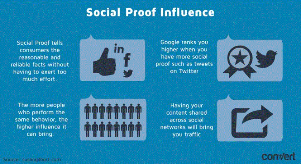
What speaks more to your products or your business than the customers themselves? NOTHING. Social proof, or testimonials, have been found to be the number one item users look for when shopping or researching a service. IF there is no social proof, there is no purchase.
Our movement in 2018 has been to focus on moving social proof sections to the forefront. This content should be front and center as an accessory to your CTA, add to cart button, or checkout process. We like to boil pages down to the bare bone necessities. That means the desired goal, brief information, and social proof. That tactic has shown time and time again to work, and we highly recommend shifting your focus on gathering and implementing your crowds as soldiers in your war for a higher conversion rate.
Make Your Product or Service a “Must Have”
Obviously, you’re already trying to make your business an essential part of people’s lives. You strive to reflect your chops as something everyone wants and everyone can have. But what if I told you that was all wrong?
The key to making your product feel exclusive is to make it seem like it’s rare, or limited, or only for those who qualify. Human nature proves time and time again that people want what they can’t have… Or at least what they can’t have.
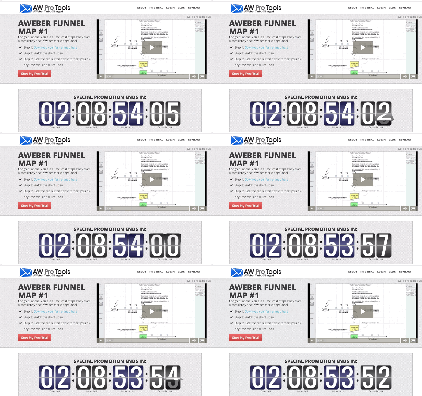
How do you do this? It’s time to test different messaging, implying that your product is one of a kind, or is only available at limited quantities. Other tactics include using timers (see below, this means a time to buy or you’re out!), or offer an email capture to “see if you’re qualified”, or even just telling users they’re flat out, missing out.
Move it On Up
This one is going to sound incredibly simple. Move your CTAs up. That simple. Let me explain.
User attention spans are dropping. Site speed is beginning to play a very large part in how users deem a website experience worthy, so the ability to get goals across early and in a simple way is essential in 2018.
Related: The Ultimate Guide to CRO
Let me give you an example: For the longest time, web designers and developers have made pages where information leads the charge for a scroll size 4000px and higher. At the end of the journey, they say “Okay, now you know, so BUY.” This works for big brands and trusted businesses with returning customers. But if you’re a shotgun business with a new idea, it’s important to use an elevator pitch of sorts that drives users to convert within the fold of the page (the fold is the section of the page you see when you load the URL).
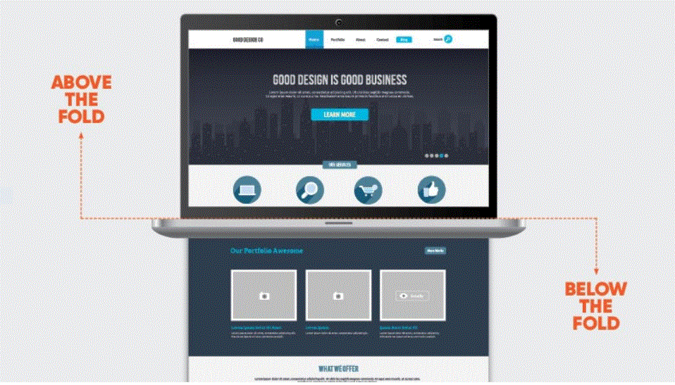
Take your CTA, or your valuable content, and move it towards the top of the page however possible, in a logical manner. Don’t sacrifice your messaging or vital info, but implement the conversion point in a place where a user an easily reach it before bouncing.
Wrapping Up
The above strategies are some we have seen work again and again this year. It’s important to expand on these ideas with your brand and product. Take them with a broad view and refine using the analytical data we spoke of in the beginning of this article. And remember:
If your test fails, test again.
