How to Choose Your Brand Colors
Importance of Color
Color plays a very important role in the identity of a brand. Color is everywhere. Our mind is attracted by different colors all the time and associates them to different things. The correct colors will help set the right tone to the message you want to perceive. The colors we choose can help enhance a design, but the wrong colors can take away from a design.

See the example above.
Same content, same design, but different colors. This is a clear example of a good color selection and a bad one. Palette “A” is clearly the winner, the page has contrasts, you can identify sections, and it is easy to read.
But How Do We Choose the Correct Colors?
There is no specific rule that says which combination of colors is better for your brand. Every brand has its own market, competitors and most importantly its own personality. If you give the same project to two different graphic designers they will probably give you two different color concepts and both could fit your brand perfectly.
So where do we start? Create a mood board. A mood board is like an inspiration board, where you incorporate images, pieces of magazine, colors, textures or whatever you have in mind that you like and that you think that defines your brand. With this mood board you will, little by little, visually illustrate the style and personality of your brand.
Once the mood board is done you can start extracting colors, the ones that predominate, the ones you like best to build a color board. Some colors won’t work together but online tools like Adobe color can help. This tool allows you to quickly build color schemes based on color structures (Analogous, Monochromatic, Triad, Complementary, Compound and Shades).
Monochromatic: The monochromatic color scheme uses variations in brightness and saturation of a single color. This scheme looks clean and elegant. The monochromatic colors go well together, producing a calming effect. The monochromatic scheme is easy to visualize, especially in blue or green tones.
![]()
Analogous: The analog color scheme uses colors that are adjacent to each other on the color wheel. One color is used as the dominant color, while others are used to enrich. The analogous scheme is similar to monochromatic, but offers more nuances.
![]()
Triad: The triadic color scheme uses three equidistant colors on the color wheel. This scheme is very popular among artists, as it offers a strong visual contrast, maintaining harmony and richness of color. The triadic scheme is not as contrasted as the complementary scheme, but it seems more balanced and harmonious.
![]()
Complementary: The complementary color scheme consists of two colors that are opposite each other on the color wheel. This scheme looks best when a warm color is placed against a cold color, for example, red against green-blue. This scheme is intrinsically high contrast.
![]()
Compound: The Compound color scheme is based on providing a range of Complementary Colors: two colors are chosen from opposite ends of the color spectrum. By doing so, the designer is allowed more freedom in their design while also benefiting from the visual appeal of complementary colors.
![]()
Shades: The shade color scheme uses the shades of one color
![]()
From Theory to Practice
There is a lot of information out there that will go deeper on color theory and that might be useful to dig into but here are some basic tips you should take into account when choosing your colors.

- Start with colors you like.
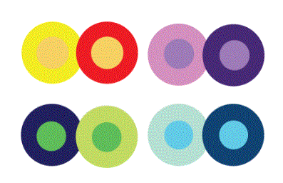
- Look for the contrast. It’s important to remember that how we perceive colors depends on the context in which we see it. Look at the pairs of circles in the example below. The middle of each of the circles is the same size, shape, and color. The only thing that changes is the background color. Yet, the middle circles appear softer or brighter depending on the contrasting color behind it. This is because the way in which we use two colors together changes how we perceive it. Even if you opt for a monochromatic palette always use the contrast to highlight elements of the design like CTA buttons for example.
- If you do not see it clearly, start with two colors. Less is more. The dominant will be the main color of your brand, and the secondary will be used to highlight key elements in your Design.
- Break with your sector. Make an analysis of your competence to identify the dominant colors and look for differentiation.
- Practice, the more you play with color the better you will get at it.


