Design-to-Development Handoff 101
For all you semi to avid sports enthusiasts who also happen to dabble in UX/UI, web design, and/or development like myself, let me provide you with a fairly unpolished, step-by-step football analogy:
- At the start of the play, the quarterback gets his guys set up in the huddle. The play is established – it’s a run play up the gut and the huddle breaks and everyone heads to the line of scrimmage.
- The center snaps the ball and the quarterback gets ready to hand the ball off to the running back.
- The handoff is botched – the ball bounces off the back’s chest and through his fingers. The ball ends up on the floor and is recovered by the opposing team.
Aside from the makeshift football games I played in my backyard and the hundreds of real games I played (on Madden), I’ve never played a single legitimate snap of football in my life. But I would think that the fumbled handoff scenario I perfectly described above was caused by a variety of factors – miscommunication between the QB and the back, a lack of focus and attention to detail, or the two just weren’t aligned on the same play. Well, the same could be said for the types of “botched handoffs” that web designers and developers deal with.
What a Handoff Shouldn’t Look Like

Let me take off my sports guy hat and get to the actual types of handoffs we’re talking about here, which is the handoff between a web designer(s) to a web developer(s). The handoff at its simplest form is the process of transitioning over a website project from the design phase (where the look and feel is established) to the development phase (where the look and feel is coded). This transitionary period is where certain problems and issues that occur later on in development, QA, and launch are stemmed from. Oftentimes, these issues are relatively small but tend to add up if they don’t get accounted for early on.
These issues can be as minuscule as using the wrong font or hex code but can also be as substantial as not accounting for a specific functionality or integration that the client needed on the website.
It’s hard to pinpoint the actual cause of an issue that happens down the road, but the most common causes in my experience include:
- A lack of focus or attention to detail
- Miscommunication between the designer(s) and developer(s)
- Lack of communication and clarity from the client
An abundance of these can lead to confusion, constant back-and-forths, and headaches throughout the rest of the website project. Now I’m not saying that there’s such a thing as “the perfect website project” where absolutely nothing goes wrong, and all things are accounted for. It’s hard not to have any glaring issues or bugs once you get into the QA/launch phase, but it’s good practice to try and alleviate any of those issues and address them earlier rather than later.
Related: How to Manage Your Team Closely… Without Micromanaging
What Works (For Us):
As with any kind of process that has the potential to be implemented, there’s going to be a vetting period where a bit of trial and error is involved. Every web design and development team has their own process that works for them. We have a fairly small dev team here at Power Digital, and we’ve gone about this current process since the start of 2018. So far, we’ve found it to be quite successful. Not to say that this process will be what it is at its current state a year or even six months from now. But it’s currently a work in progress that is so far, well, working.
Handoff the Project to Your Developer or Dev Team Using a Task Manager
One word that I have yet to mention so far, and is arguably the main reason for this article, is organization. It’s easier said than done, which is why it’s imperative that when multiple people need to be aligned on one particular goal — in this case, creating an awesome website – organization should be put at the forefront during the handoff process.
The task manager of choice here at Power Digital Marketing is Asana. Asana can do wonders for you in terms of getting your workflow as organized as possible. You have the ability to assign specific tasks and sub-tasks out to team members, create project boards, project timelines, and calendars, keep track of progress, and more. The way our dev team uses Asana for website projects is via Asana’s project board feature.
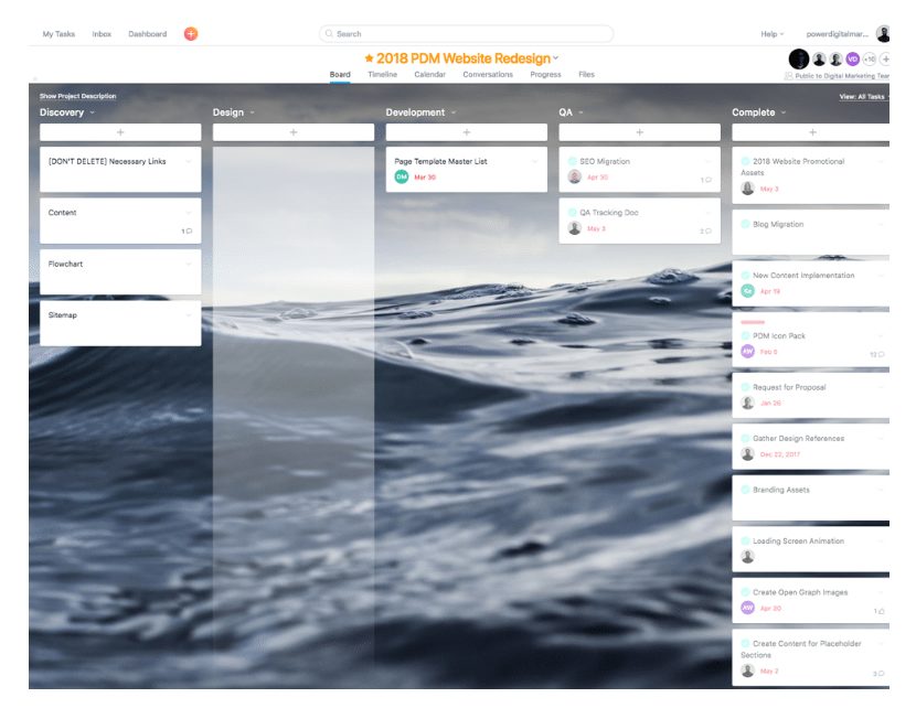
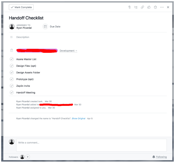
For the most part, it gives us the ability to house any and all assets necessary for any given project in one place. We set it up so that every aspect of a website project from start to finish is created, accounted for, and assigned to whoever’s responsible for that particular task. For handoffs, we also use subtasks to ensure that we’ve checked off every part of the checklist prior to the start of development.
Suggested Tool(s):
- Asana
- Trello
Provide Design Files and All Necessary Assets
This one is almost a given. As a designer, part of your responsibility is to set your developer(s) up for success. One key step in doing that is by providing your developer(s) with the necessary design files (or specs) and assets that they’ll need to develop the site. Seems obvious enough, right? However, there are a few specifics that need to be accounted for instead of just simply sending over an unorganized ZIP file to your developer(s) and calling it a day.
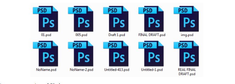
First and foremost, organize your file(s). For some designers, including myself, at some point we’ve succumbed to at least one, or both, of these despicable habits either in design school or early on in our careers:
Improper naming of file(s):
Improper naming of file layers:
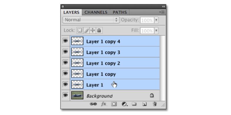
Let’s be kind to our developers and break out of this habit if you haven’t already done so. Taking a few quick seconds to group your layers and name them accordingly help your developer(s) easily navigate through your file(s) and develop in tandem with how your designs are laid out.
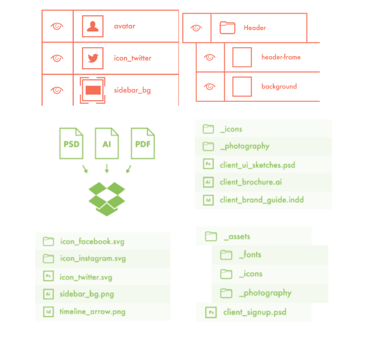
Photoshop Etiquette does an excellent job of elaborating on this, and other best practices on how to properly put together your design files so your developer(s) don’t hate you.
Design Specs
Another important thing to take into account is whether or not the developer(s) you’re working with is familiar with the design platform you’re using. Obviously, the best route would be to use a platform that your developer has access to so that there’s a sense of familiarity. But with more platforms releasing with a varying degree of features and pricing plans, it may be difficult for some developers to get access and justify paying for something that they’ll only use a quarter of the features for.
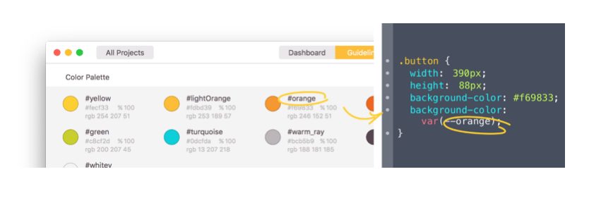
Our team previously went the route of using Photoshop solely for design, but eventually realized that it was too bloated of a software for ideal web design use. We also vetted integrating designs with Invision and tried designing with Sketch, but those didn’t work out for us either. Fortunately for us, at the right time Adobe XD graduated from its Beta stage and launched as part of Adobe’s Creative Cloud suite. Since then, it became our go-to design platform. Not only is it a great, easy-to-use design platform, but it also filled in the void that our developers needed to do their jobs: design specs. Publishing design specs from your Adobe XD file makes it seamless for your developers to access the right specifications to use for development based on your design.
Zeplin is another great platform that we’ve adopted, specifically for handoffs and design specs. In a nutshell, Zeplin does everything that XD’s design specs offer, but also generates the appropriate CSS. At the start of the year, Adobe announced that they’d added a seamless Zeplin-XD integration as well, making the handoff process that much easier.
Suggested Tool(s):
- Adobe XD
- Photoshop
- Sketch
- Invision
- Zeplin
Related: Top 10 Best Tools for Web Designers
Provide a Prototype
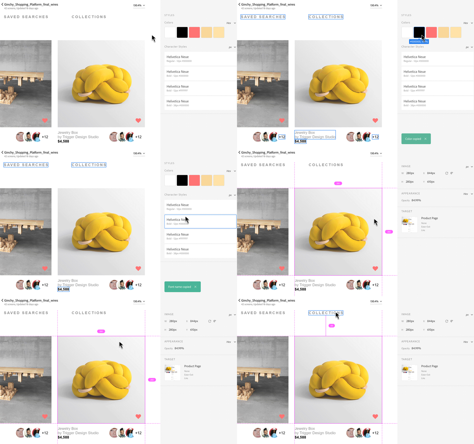
Interactive prototypes do an excellent job of illustrating the navigational structure intended for the website, as well as the basic user flow, animations and interactions, and the internal linking of the site. Not only is this enhanced visibility of the designs beneficial for clients, but the same thing goes for developers as they begin building and mapping out the website. Tools like Invision and Marvel do a great job of turning basic mockups into working prototypes. Fortunately for Adobe XD users, prototyping is another great built-in feature that makes it easy for designers to transition from designing to prototyping with the simple click of a tab.
Suggested Tool(s):
- Adobe XD
- Invision
- Marvel
Related: What is Responsive Design?
Have a Handoff Meeting
Not much needs to be said for this one. Alignment and organization between designer(s) and developer(s) is the key to great project success. From my experience, there’s no better way to do that than through a meeting between those involved with one goal in mind: execute a proper handoff between design and development. This is your time to hash out any quirks and questions from both sides, and prepare for what’s to come in the development, QA, and launch phases.
Conclusion
The purpose of this post isn’t to convince you that the way our team does things is the correct way to do things. All I’m really trying to do is express the importance of processes and systems to help bolster efficiency and productivity within your team’s workflow. How your team chooses to go about implementing these processes and systems is completely up to you and your team to hash out. Just keep in mind that a proper handoff shouldn’t be this grey area in a project that comes back to haunt you in the execution phases. Rather, it should be a brief period of alignment and goal-setting that will help designers and developers create a better product in the long-run.


